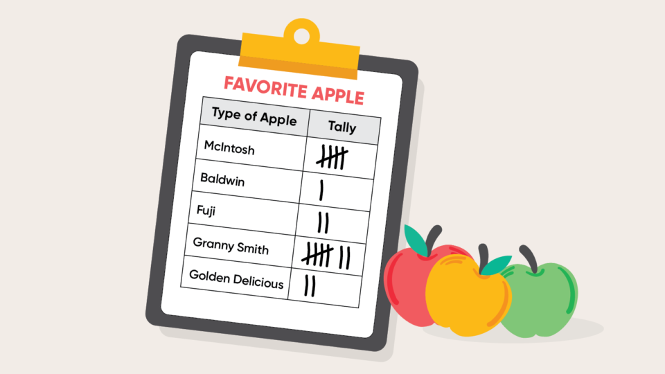
By Grade 4, students typically learn various ways to collect and organize data. In Grades 6 and up, students learn how to describe the data mathematically, using concepts such as mean, median, and mode. In this article, we review different ways to represent data and then compare different ways to describe the data.
Key Standard:
- Summarize numerical data sets in relation to their context by giving quantitative measures of center, such as median or mean. (Common Core: 6.SP.B.5.C, Florida B.E.S.T.: 6.DP.1.2)
Review Standards:
- Draw picture graphs and bar graphs to represent a data set with several categories. Solve problems using information presented in the graphs. (Common Core: 3.MD.B.3; Florida B.E.S.T.: 3.DP.1.1)
- Make a line plot to display a data set of measurements. Solve problems using information presented in line plots. (Common Core: 4.MD.B.4; Florida B.E.S.T.: 3.DP.1.1 and 4.DP.1.1)
Collecting and Organizing Data
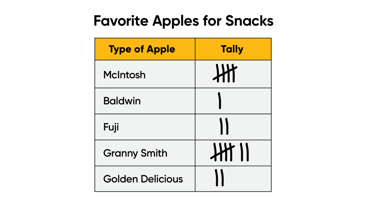
They may have already started to learn how to collect data using a tally chart. In a tally chart, the student separates categories into rows or columns, and each time one of the categories is counted, the student writes a tally mark to keep track of it. Every fifth tally mark is indicated with a diagonal line that intersects the previous four tally marks and makes it easy to count the total number of tally marks for the category.
Typically, a tally chart is used when several things are being counted at once, for example when collecting survey responses. If you have students from other countries, ask them if they know different ways to represent tally marks! For instance, students in France, China, and Brazil learn to indicate tally marks differently but still cluster them by fives. The tally chart below shows the results of a survey in which students identified the type of apple they like to have for a snack.
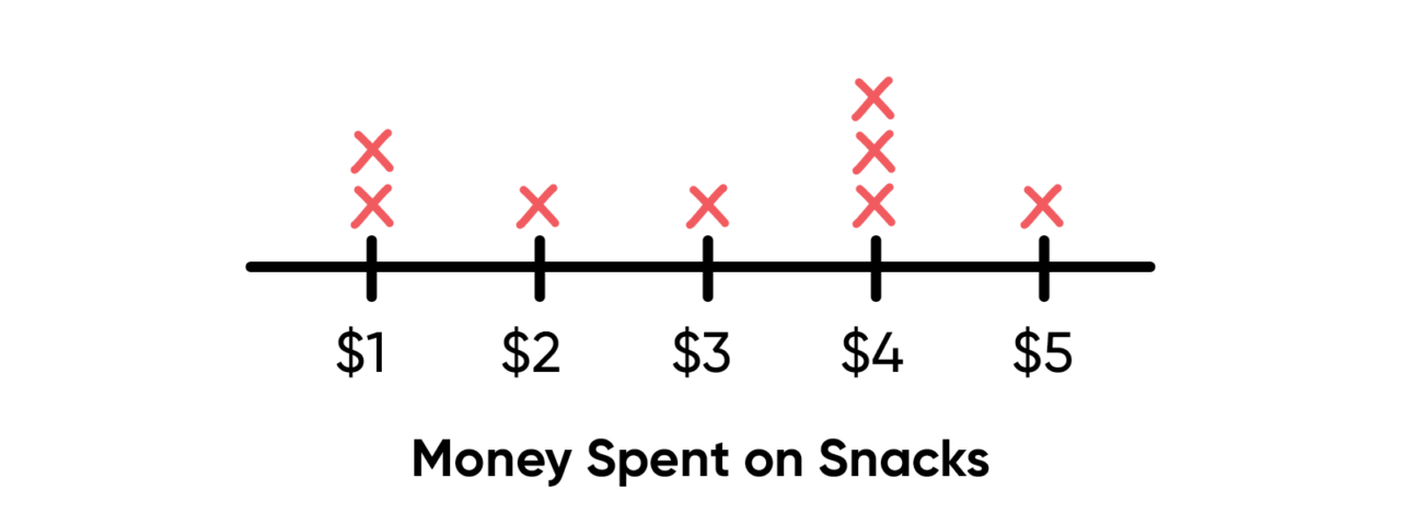
Line plots (or dot plots) are another way to organize data as it is being collected. Place possible values for the data evenly along a line or axis, and then indicate each time a value occurs within the data. The line plot below shows the amount of money eight students spent on snacks, for example.
Calculating Mean, Median, Mode, Outliers, and More
Once students feel comfortable reading charts and graphs that display data, such as tally charts or line plots, introduce them to the different ways to describe data.
The range is the difference between the greatest and least value in a data set. The steps below calculate the above dot plot range:
- The greatest value is $5, and the least value is $1.
- The difference is $5 – $1, or $4.
- The range for the amount of money students spent on snacks is $4.
The mode is the value that occurs most often in a data set. Some data sets don't have a mode; others have more than one mode. The steps below calculate the above dot plot mode:
- The value $4 occurs three times, and all other values occur only once or twice.
- The mode for the amount of money students spent is $4.
The mean is sometimes called the average. To find the mean, add the values and divide by the number of addends. The steps below calculate the above dot plot mean:
- $1 + $1 + $2 + $3 + $4 + $4 + $4 + $5 = $24
- There are 8 data points (1, 1, 2, 3, 4, 4, 4, and 5).
- $24 ÷ 8 = $3
- The mean for the amount of money students spent is $3.
The median is the middle value in a data set that is ordered from least to greatest. When there are two middle values (i.e., there are an even number of data points), the median is the mean of these two values. The steps below calculate the above dot plot median:
- $1 $1 $2 $3 $4 $4 $4 $5
- $3 + $4 = $7
- $7 ÷ 2 = $3.50
- The median for the amount of money students spent is $3.50.
An outlier is a number that is distant from most of the other data. There is no agreed-upon precise mathematical definition for an outlier like there is for median or mean. The data shown on this line plot do not have an outlier. However, imagine that one student had spent $100 on snacks. Then $100 would be an outlier. Data sets can have multiple outliers, too. For example, if two students had spent $15 and $100 on snacks, then $15 and $100 would both likely be considered outliers.
Encourage your students to use range, mean, median, mode, and outlier when they describe data sets. For students ready for more advanced activities on describing data, consider checking out our high school activity set on measures of central tendency.
Comparing Data Using Graphs
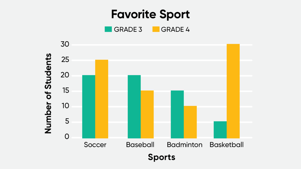
When you want to compare data, one common way of displaying data points to help you is using a bar graph. To create a bar graph, list the different categories or values of the data set along one axis, and use the other axis to indicate how many times those categories or values occur. A double bar graph can be used to compare two sets of data in one graph, usually about the same topic. The double bar graph below shows the favorite sports of third and fourth graders.
You can use a line graph to show how data changes over time. Line graphs require that the data set is numerical and can be placed in order, unlike the sports survey above. Place the data set elements evenly spaced out across a line, or axis. Determine the corresponding value for each element of the data set, and indicate those values along the other axis. Connect the resulting points with line segments. For example, the line graph below shows the change in temperature from 5:00 A.M. to 8:00 P.M.
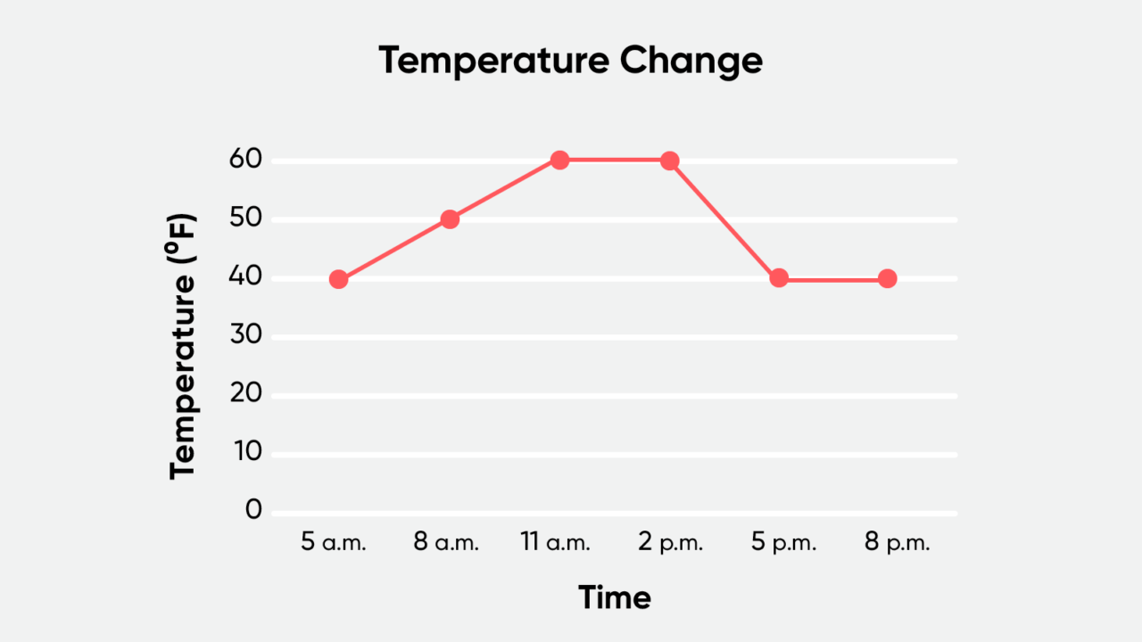
Line graphs are a common way to display data and are used across many contexts. Show your students graphs that cover a variety of topics, for example, graphs from science and social studies books. Practice converting between data sets and graphs.
Extending the Lesson
Consider turning the real-world graphs into a class activity. Have students look for an example graph from a book, magazine, website, or social media post. Help students turn their graph into a data set, perhaps by evaluating the y-coordinate at each point along the x-axis. You can help show students how to find the mean of a graph. And what about the median, mode, and range for their graph? Are there any outliers? What does each value signify?
This blog post, originally published in 2019, has been updated for 2021.
***
Grow student confidence in mathematics with HMH Into Math, our core math solution for Grades K–8.
Teaching absolute value can help students understand the distance of a number on the number line from zero, regardless of the direction from zero that the number lies.

Help students gain greater understanding of measures of central tendency and dispersion, outliers, transformations of data, and sampling techniques.

Here's a helpful list of healthy habits to enable a growth mindset in math, plus a free downloadable poster for your classroom.
Related Reading

Ms. Madge Alexandre, Miami-Dade reading teacher and Read 180 user


